如何撰寫容易閱讀的網頁
參考資料:撰寫網站資料的 11 條金律
目錄
- 1 認識你的受眾(Know your audience)
- 2 遵循倒三角形的模式(Follow the “inverted pyramid” model)
- 3 使用簡短、簡單的句子(Write short, simple sentences)
- 4 使用積極的語氣(Stick to active voice)
- 5 Show, don’t tell
- 6 避免使用術語(Nix the jargon)
- 7 活潑你的選字(Mix up your word choice)
- 8 讓你的文字容易「掃描」(Make text scannable)
- 9 善用多媒體(Incorporate multimedia)
- 10 注意網站內容的層次(Layer website content)
- 11 留給他們想要更多的空間(Leave them wanting more)
認識你的受眾(Know your audience)
It sounds simple, but so many writers put pen to paper—or finger to keyboard—before thinking about who it is they’re trying to reach. Before drafting content, ask yourself these questions: Who is my primary audience? What about a secondary audience who can influence and inform my primary audience? How will they find my site online?
For example, say you’re creating a website for a law firm. Your primary audience might be existing clients. However, your secondary audience is much broader and could include other attorneys, law reporters, or anyone who might need your services in the future. You’ll need to make sure your content is both accessible and interesting to all of these audiences. What kind of questions might these groups ask about a particular topic? Where are they most active online? What kind of information do they need?
Audiences find web content through many different paths—social media sharing, links from other websites, email sharing, and search engine results. That last method is especially important when you write for the web. Text could be extremely well-written and informative, but if it’s not optimized for search engines, chances are few people will find it. Think of your audience again: what search terms would they type into Google? Make sure to include those terms in headlines and sub-headers.
遵循倒三角形的模式(Follow the “inverted pyramid” model)
Web readers have short attention spans—they’ll decide whether your site has the information they need in seconds. Structure your content like an upside-down pyramid or cone. The most important messages go at the top of the page. Then, gradually drill down to the more specific, supporting information. End with tangential details.
For example, say you’re creating a webpage about a conference. The most pertinent details—a description of the theme, date, and location—would appear at the top of the page. Supporting details like speakers and their lecture topics would follow. The less important information—such as conference organizers, the history of the conference series or a list of related resources—would appear at the bottom of the page.
These two graphs helped guide our own website makeover and can help you conceptualize the structure of your site.
The Cone Principle of Organizing a Website
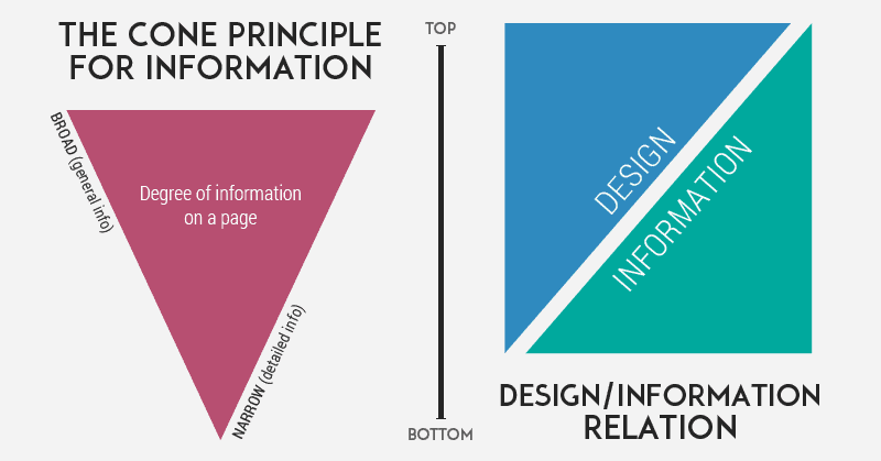
These two graphs can help you conceptualize the structure of your site.
使用簡短、簡單的句子(Write short, simple sentences)
Long sentences are for Charles Dickens—the short attention span of today’s reader demands sentences of 35 words or fewer. And according to webpagefx.com, the average American adult reads at a 7th to 9th-grade level. So website content that’s accessible and easy to read will naturally reach a wider audience.
Focus on using nouns and verbs; use adverbs and adjectives sparingly. Don’t use words like “equanimity” or “obfuscate” when words like “calm” or “confuse” will do.
If you’re not sure what grade level you write at (like most of us!) then it’s useful to check how your texts score on readility models.
Most of the popular models are based on the length of words and sentences in a text. Your text’s readability is then scored by a number or an education level. These three tools will scan your text and score its readability:
The Readability Test Tool The Readability Calculator Microsoft Word Can your text be easily understood at a 7th to 9th-grade reading level? Check how it scores on the Flesch-Kincaid Grade Level to find out.
使用積極的語氣(Stick to active voice)
Use active rather than passive verbs, and specify the subject of the sentence. For example, rather than writing “A coffee was ordered,” write “The man ordered a coffee.” Instead of saying “Products can be ordered on our website,” say “You can order products on our website.”
Active voice helps create succinct, reader-friendly sentences. It’s also more direct; when you speak directly to the audience (“You can do it”) it’s more engaging than saying “It can be done.”
Show, don’t tell
Don’t limit your prose to generalities and high-level statements. Specific, real-world examples help readers better understand and visualize your messages. Consider these two descriptions:
This is the best dog toy money can buy.
Or
We made the “Rough Rover” dog toy from durable, 100 percent natural rubber, designed to resist punctures and tears from even the most dedicated of chewers.
Which version gives you a clearer picture of the type of toy you’re buying? Specific details in the second description show readers the dog bone rather than tell them about it.
As an added bonus, more specific, descriptive product information helps your website’s SEO and gives customers the information they need to make those purchases.
We love the product descriptions on Zingerman’s website—they explain in mouthwatering detail why their gourmet foods are the best choice.
Example of a detailed product description We love the product descriptions on Zingerman’s website—they explain in mouthwatering detail why their gourmet foods are the best choice.
避免使用術語(Nix the jargon)
The web is for everyone—not just technical experts. So make sure information is understandable for the educated non-specialist. Spell out acronyms on first reference. Avoid insider language. Explain complex or niche terms. And provide hyperlinks to other articles where readers can get more background information on a particular topic.
Consider this sentence:
The journalist grabbed a SOT from the MOS, drove back to the station and put the story in the can.
Many of these terms are comprehensible only to broadcast journalists. A reader-friendly revision would be:
The journalist interviewed a bystander about the incident, and recorded her statement to include in the story.
This tip is especially important if you work in a technical industry, but want your website to attract non-expert customers. Remember that you need to write for your audience (see point #1) and not for your colleagues. Using accessible language will help you come across as approachable and open—just what you want to convey to future customers.
活潑你的選字(Mix up your word choice)
Words are like cookies—we all have our favorites. But when it comes to keeping your visitors interested, variety is key! Word clouds are fun to use and can help you vary your word choice by visualizing which words you use the most. Just copy and paste your text into a free word cloud tool like this one to generate your cloud. The more you use a word, the bigger it will look in your cloud. Have you overused a certain word? Type it into Thesaurus.com to find new synonyms to enhance your text.
Negative words standing out in your cloud? Now you know exactly what to tweak for a more positive tone. Keep an eye out for your website keywords as well: these should appear several times in your text, so it should be easy to recognize them in a word cloud.
Here’s the exception: keep key terms consistent across your site to avoid confusing your visitors. For example, if you’re a photographer, don’t offer “photoshoots” on one page then call them “photography sessions” on the next.
Make a list of terms that describe your company and group together any words you use to mean the same thing. Pick your top choice and stick to it everywhere on your website. Like this:
Use: invoice .
Not: bill
Use: photoshoot
Not: photography session, photo appointment, shoot
Do you call your customers clients, patients, or users? Do you refer to services, packages, or plans? Once you have this list, you can use it to review any text before you publish it.
讓你的文字容易「掃描」(Make text scannable)
In addition to putting the most important information up top, make sure text is easy to skim. Most web readers will scan the page to find the specific piece of information they’re looking for—if they don’t find it easily, they’ll move on.
Don’t believe it? Try paying attention the next time you open a webpage you haven’t seen before. Are you reading every word beginning to end? Or is your eye jumping around, looking for the information you want?
Instead of text-heavy paragraphs, use bulleted or numerical lists. Instead of one long page of text, organize content into labeled tabs. Always include “white space.” This is the empty space that surrounds paragraphs, images, and other elements on your web page. Though it may seem like this is just wasted space, it’s actually a web designer’s best friend. Comfortable amounts of white space around text make it more legible, and more enjoyable to read.
Example of using headings to break up the page
Here’s an example of how to use Headings to break up a page and make it easier to read.
It’s also important to divide content into sections with descriptive sub-headers. For example, a webpage about climate change might organize information under the following headings: What Is Climate Change? Drivers of Climate Change Current and Projected Impacts of Climate Change Solutions to Reduce Emissions Learn More These sub-headers not only help readers navigate the page, they’ll help search engines find your content. On your Jimdo site, just select the text you want to edit, highlight your heading, then hover over the Style options to set your heading size. Use one large (H1) heading at the top of each page, use medium (H2) headings to separate your main content, and use small (H3) headings for any minor points.
善用多媒體(Incorporate multimedia)
Sometimes a picture—or infographic or video—really is worth a thousand words. Research shows that 90 percent of the information transmitted to the human brain is visual, and people process visual information 60,000 times faster than text. An easy-to-read chart or graph can also do a better job of explaining a complex topic than text alone. If you’re not a graphic designer by trade, there are lots of ways to use visuals on your website and some great services out there to help you make graphics yourself, like Canva and Piktochart.
Images also help break up text, making your page easier to read. We recommend having at least one image on each page of your website.
注意網站內容的層次(Layer website content)
The great thing about a website is that it’s easy to direct readers from one page to another. Help readers find more great content by hyperlinking certain words or phrases to other relevant resources, especially those on your own website. This will help keep people engaged with your content and moving through your site.
For example, say this sentence appeared on your cooking website: Ratatouille is a low-fat dish that consists of seasonal ingredients like eggplant, squash, and tomatoes. You could hyperlink “low-fat dish” to a page with other blog posts on healthy eating.
Building these internal links within your own site also helps your SEO, but keep in mind that links should always be relevant and helpful. Visually, if you overload your text with links, people won’t know what to click on. Google recommends keeping the amount of hyperlinks on a page to a “reasonable number.”
Button Element Example Here’s an example of what a call-to-action button can look like on your website.
留給他們想要更多的空間(Leave them wanting more)
Here’s an example of what a call-to-action button can look like on your website.
Good websites end each page with a strong call-to-action (or CTA for short). With Jimdo, you can too—with easy-to-customize buttons on your website. Is there a person a reader should contact for more information? An interesting video they should watch? How about a related blog post they can read or a report they can download? This strategy helps direct readers to other areas of your website and encourages them to promote your content to their friends and family.
Keep these calls-to-action succinct, and start them with action verbs like “Download,” “Share,” “Join,” “Sign Up,” “Learn More” or “Watch.” And of course, make sure to include a hyperlink that actually allows readers to fulfill the action you’re asking them to take.
Writing, in general, is hard work—writing content for your website, even more so. But remember, you don’t need to write perfect texts first time around! Once your content is live, you can do monthly website checks to monitor and optimize its performance. With these tips, you’re prepared to create effective content that resonates with even the most flighty and time-pressed of internet readers.
And once your content is written, read this checklist for designing easy-to-read text on your site.